Were half way through the two week Easter break and I feel so disoriented at where I am and what I need for the criteria, I don't have my work space I don't feel free to create like I was in my bay. Over the past few days I have managed to organise other parts of whats needed and have managed some pieces which seem to fit well.
Tuesday, 19 April 2011
Monday, 11 April 2011
STAG.

A trip to Scotland and my parents return with a stags skull antlers and all.

My project has turned a corner and texture has became a main focus allthough animals dont really have a place in my work the structure of the skull and the emotion it brings does.

Eye socket.

Nose.

Jaw.

Nose interior.

Nose interior.

Back of the skull.
Friday, 25 March 2011
Snippits of my day...

Today i created these long paper designs, iv tried to make them interesting in texture and form using Tracing paper and the negative option on the photocopier.

Latex and ink work amazingly together, but stinks when applying it!


The photocopier failed to feed the tracing paper through but its a happy accident i guess as the top layer hasnt printed so leaves the hues of colour uncoated.

I realised ink and varnish particularly wet varnish created a beautiful organic line once dry, i love this idea and now have used it as a detail connection to flow through my work.
And away we go!

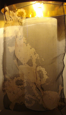
Im starting to look at my photocopies onto tracing paper again, and i have decided that i love the layered element of the piece so digital print onto organza maybe an option ???
Thursday, 24 March 2011
Ink and Varnish
As i have changed my specialism area i feel i have to change my blog name as it no longer holds any connection with my work. Hope everyone likes it.
Friday, 18 March 2011
Tutorial...
Feedback from my tutorial could not have been better, we have came to the conclusion my designs will be better suited to textile art peices insted of fashion for mens wear. In a way im relieved I can concentrate on my work now and have the freedom to use mix media without thinking all the time about how I could make it into a manufacturable peice. I love menswear but feel that my work has moved on and im really excited about it!
Monday, 14 March 2011
7 weeks to go...
I have started a new screen to add texture to my prints as the nature of my project demands this detail, i have used some of my earlier drawings to put forward into screens things like barbed wire, silhouettes of body and their outlines i will be printing from this screen tomorrow so any good results would be fantastic!
Thursday, 10 March 2011
from the dye lab...
From my imagery taken of the scrap metal i picked out the plug and chain particularly because of the detail, after drawing it i have created a screen with an abstract repeat print.

I wanted to create a transparent ghostly feel to my prints which is why i have chosen to base them around light delicate fabrics.
After using black acid dye on the hot plates i washed them and decided to print using discharge paste, i have never used this technique before but after these outcomes it is perfect to carry throughout my future samples.

I am going to look at adding detail using clear and metallic foils and rusty copper tones via screen print

Thursday, 24 February 2011


One to watch.
Maria Grachvogel

These fabrics are so beautifully used and the collection as a whole, is so elegant and feminine.
These fabrics are so beautifully used and the collection as a whole, is so elegant and feminine.
Christopher James
Christopher James

Why is it that women's wear get to have beautiful interesting surfaces, would this style of decoration not work on men's wear?
Why is it that women's wear get to have beautiful interesting surfaces, would this style of decoration not work on men's wear?
London Fashion Week : (
Menswear for LFW has been so disappointing, out of the 12 designers from today's post barely 3 of them are interesting. Top shop's Tweed "Look" have unusual garment shapes but the lack of diversity in fabric makes it feel so repetitive throughout the collection, Katy Eary is again pulling it back for Menswear with bright punk styles with plastic detail and shiny fabrics. I am in no way saying each collection is not pushing design but very few people seem to be producing textiles or printed surfaces to push menswear into a place of interest in terms of surface adornment.


Rust.

Im actually so excited by this, its like finding treasure to me!
Thursday, 17 February 2011


Ruined photos
I decided to try and create a mood within my work after being inspired by Antony Gormley.

I love this disroyed effect within the image it looks so worn and seemes to give such a sinister feel because of the negative space and the solid body in the foreground.


I love this disroyed effect within the image it looks so worn and seemes to give such a sinister feel because of the negative space and the solid body in the foreground.


"Fluffier than meringue to as dark as death"

My final major project is based on the torture camps in Auschwitz in WW2, I don't want to look at the obvious as its not my way of working, Abstract landscapes bodies and anything sinister is catching my attention at the moment I want to look at striking imagery as development into digital print, hand embroidery and screen print as I think this could throw up some interesting ideas and textures.
Subscribe to:
Posts (Atom)